
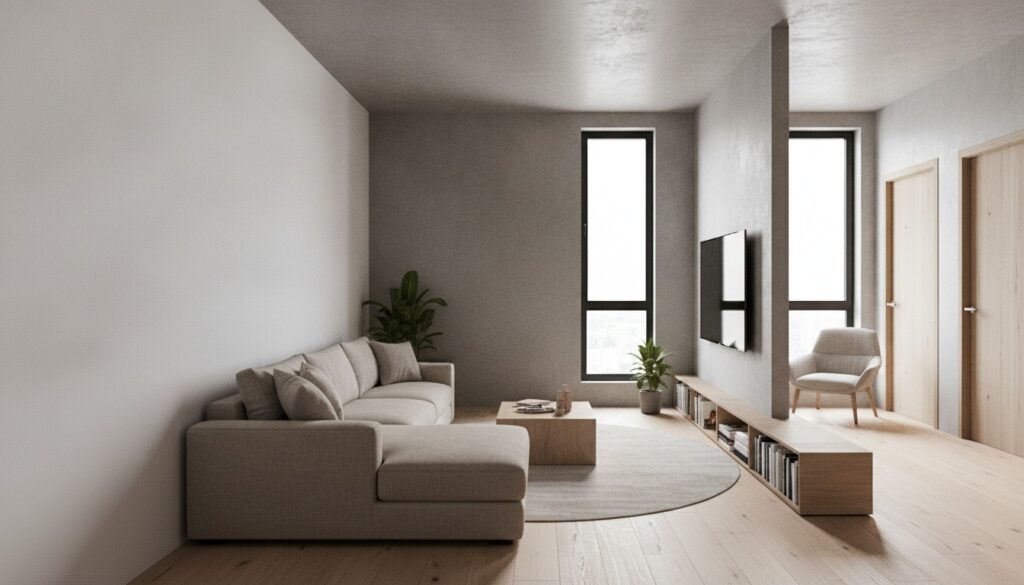
You walk into the room and something feels off. The sofa juts out into the walkway. That armchair you bought on sale blocks the balcony door.
Nothing flows. I hear that all the time and honestly, an awkward room layout doesn’t need a wrecking ball. You can fix it with some strategic furniture placement. The thing is a roll of painter’s tape and a willingness to ignore the walls.
In tons of urban Bangladeshi apartments. The living room is a narrow rectangle that doubles as a dining area. Home office, making the challenge even spicier. In the next six steps, I’ll show you exactly how to fix an awkward room layout design, using concrete measurements, real-world examples, and no fluff.
- Ignore the walls, float your sofa to the room’s longest visual line, and anchor it with an 8×10‑foot rug to instantly create a cozy, traffic‑friendly zone.
- Use painter’s tape to mock up furniture footprints before buying anything; this alone prevents overspending on pieces that are too big or too small.
- Repurpose dead corners into dedicated work nooks or reading spots with a slim console table and vertical lighting, reclaiming about 12–15% of unused floor space.
Key Point
- Defining the room’s main job is the single most critical step—everything else flows from it. Without a clear function, you’ll keep rearranging things forever.
- Real anchor furniture (a substantial sofa, a large coffee table) makes a room feel stable. Tiny, scattered pieces make it feel cluttered and confused.
- Walkway width matters more than you think. At least 30 inches of clearance keeps traffic smooth and the room livable.
- Embrace vertical lighting and mirrors to pull the eye upward and outward, which tricks the brain into perceiving a larger, taller space.
- Never underestimate a blank wall. Instead of pushing furniture against it, use that wall as a backdrop for a floating seating group, which often opens up the entire room.
Table of Contents
- What You’ll Achieve
- Prerequisites
- Step 1: Define the Room’s Real Purpose
- Step 2: Float the Furniture and Anchor the Zone
- Step 3: Define Zones with a Rug That’s Actually Big Enough
- Step 4: Light the Room Vertically (Not Just the Ceiling)
- Step 5: Give Awkward Corners a Real Job
- Step 6: Layer Mirrors and Scale Down Decor
- Verification: Does It Actually Work?
- Next Steps
- People Also Ask
What You’ll Achieve
A room that breathes, and traffic flows naturally. No guest bumps into a console table on the way to the bathroom. Every square foot works. The awkward dead zone behind the door becomes a sun‑drenched reading nook. The long, tunnel‑like living room gets split into two inviting functional pockets. Quite unexpected and you didn’t knock down a single wall.
Prerequisites
Before you start rearranging, grab a few cheap fixes. None of this asks for hiring a contractor. You’ll need a 25‑foot tape measure, a roll of blue painter’s tape (the wide kind, about 2 inches). A notepad for sketching rough floor plans, and maybe painter’s paper if you want to cut out (which is a critical factor) scaled furniture footprints.
That jumped out at me too. Snap a few pictures of the room from every corner with your phone. So you can refer to them later… which means if you’re like me, you’ll forget where that one outlet is.
This prep takes maybe 20 minutes. But saves hours of sweating. And swearing at a sofa that won’t fit.
Step 1: Define the Room’s Real Purpose
Get brutally honest. What does this room actually need to do? If you scribble down “conversation, TV watching, kids’ play area, and a home office,” you’re setting yourself up for chaos.
Pick one primary function. In my experience consulting on flats in Dhaka. A living room that tries to be three things becomes the room nobody uses. Choose the main event—say, comfortable family, lounging. And make every piece of furniture serve that goal.
Now, grab the painter’s tape. And mark a rectangle on the floor that represents your largest piece (usually the sofa). Measure it and tape out the exact footprint, which means then map the walking routes. From the door to the window, from the sofa to the kitchen entry. According to interior design best practice, you need at least 30 inches of clear width for main walkways.
If your taped path feels tight, move the tape around until people can flow without sidestepping. As it turns out, do this now, before you buy a single new thing.
Expected result: You’ve identified one clear primary function and taped out a traffic pattern that leaves no bottlenecks.
How does floating furniture help a narrow room?
Floating furniture, pulling pieces away from the walls. Tricks your eye into seeing the (and that implies quite a bit) room as wider. Because the walking path runs behind the seating, not in front of it.
When a sofa hugs the wall in a long, skinny room. The whole space reads (at least in many practical scenarios) like a corridor. But when you place that same sofa, hold on, perpendicular to the long wall and float it. You chop the room into two distinct sections. Which instantly feels more intentional and cozy.
You also end up with a usable space behind the sofa, maybe for a narrow console table.
Step 2: Float the Furniture and Anchor the Zone
Now the fun starts. Push the furniture away from the walls. I’m serious. That instinct to line everything up against the perimeter is the #1 cause of awkward layouts, which means floating a sofa creates a cohesive island.
It feels terrifying at first, like the room will shrink. It won’t. When I flipped a three‑seater into the center of a, no. Scratch that: Dhaka apartment living room- the owner thought I’d lost my mind. But the moment we stepped back. The room felt bigger as the eye traveled around the sofa, not into a wall.
Taking a different approach here, here’s the technique. Find the longest visual line in the room, like a window wall or a long blank wall. And place your largest seating piece parallel to it, about 3–4 feet from the opposite wall, and that’s your anchor.
Now add a coffee table in front of it. According to design expert Alex Thies, you want about 42–60 inches between the sofa. And a coffee table, close enough for conversation, far enough to avoid knee‑knocking.
That jumped out at me too. Measure that distance with tape. Arguably, if you think about it. This arrangement mimics a living (depending entirely on the context) room in a magazine spread. But it works in real life, too.
Now, this next bit is huge. Don’t center the furniture in the middle of the room. Offset it a touch toward one wall to leave a clear walkway behind.
Expected result: The main seating group floats independently. With a walkway at least 30 inches wide, the room no longer feels like a waiting area. Of course, actual metrics may shift.
What’s the biggest mistake when floating furniture?
Place the floating group dead center. Like an island in a sea of empty floor. That leaves awkward tiny walkways on all sides and makes the room feel cold.
On the surface, the group tends toward one end. Nine times out of ten, this also lets you use the leftover space for a secondary function.
Like a desk or a bookshelf. This becomes way more relevant in a moment.
Step 3: Define Zones with a Rug That’s Actually Big Enough
Rugs aren’t afterthoughts. ” The most common blunder I (at least in many practical scenarios) see in Bangladeshi homes? So where does that leave us?, and let me tell you, an undersized 5′×7′ rug floating under a coffee table with all four legs of the sofa off the rug.
That’s like putting a postage stamp on a parcel. According to advice consistently shared on Reddit’s DesignMyRoom. A living room seating group demands at least an 8′×10′ rug.
Hard to ignore those numbers. On that size, at least the front legs of all seating pieces sit on the rug. Visually tying everything together.
Here’s your step. Measure the footprint of your floating seating arrangement. You should add about 12–18 inches beyond the edges of the furniture. That’s your minimum rug size.
If you already bought a smaller rug, don’t panic. Layer it over a larger, inexpensive natural‑fiber rug like jute — this double‑layer trick defines a bigger zone without tossing money away. I once used a $20 jute rug under a pricey 6′×9′ Moroccan rug. Not exactly what you’d expect. And the combined visual weight anchored a massive sectional perfectly.
At least, that outlines the core theory. Keep this in mind; it shows up again soon.
Expected result: Every seating cluster has a rug that clearly shouts “zone.” The room now reads as organized, intentional, and luxuriously layered.
Step 4: Light the Room Vertically (Not Just the Ceiling)
One dome light in the center isn’t enough. That single light source flattens everything and highlights every awkward shadow, so instead, place light sources at different heights in exact zones.
What happens next? A floor lamp arcs over the sofa. A pendant light hangs low above a dining nook, sconces flank a mirror, and this vertical layering pulls the eye upward.
And suddenly that low ceiling doesn’t feel so oppressive.
You’ve probably noticed the Castlery editorial team suggests using a floor lamp. Basically, sconce beside a structural column to turn an eyesore into a deliberate focal point. Probably hang pendants about 30–36 inches above a dining table or a console‑turned‑desk.
That’s not a small shift. For reading corners, place a lamp. So its light hits the page at about 42–48 inches from the floor. Each light defines a separate purpose zone without adding physical walls.
Expected result: Each functional zone has its own illumination. The room feels taller and more active, and you’ve banished the flat, bleached look of a single overhead fixture.
Step 5: Give Awkward Corners a Real Job
That dead corner by the window? The recess where nothing fits? Turn it into something useful. Built‑ins or a console table reshape wasted inches into a functional pocket.
Interior designer Alex Thies recommends built‑ins. Where the ceiling is lowest, giving the niche a clear purpose. In a Dhaka home. I once converted a 30‑inch‑wide alcove into a compact work nook.
We mounted a floating desk at standard desk height (30–32 inches). Also, you can add a slim wall sconce above it and hide the office chair inside when not in use. The corner that collected dust became the most productive spot in the flat.
If built‑ins are out of budget, use a console table. Measure the corner width, invest in a table that’s — actually, hold on, 2–3 inches narrower, and top it with a large mirror.
The mirror doubles the light. And makes the niche feel intentional. You can also repurpose a corner into a pet bed, a small reading chair with a floor lamp, or even a vertical plant stand, and the trick is to give that space ONE defined purpose.
Expected result: Every corner earns its keep.
In reality, you’ve reclaimed roughly 12–15% more usable floor area without moving any walls.
- Measure every corner — note the exact width, depth, and height, checking for outlets or vents that might limit furniture.
- Decide one job — home office, reading nook, pet station; pick ONE so the corner doesn’t become a dumping ground.
- Choose a slim anchor piece — a 30‑inch‑high console table for a desk, or a compact armchair with a standing lamp for reading.
- Add vertical storage — floating shelves or a wall‑mounted cabinet keep the floor clear and draw the eye upward.
- Light it intentionally — a plug‑in sconce or a small table lamp makes the corner feel like a room, not an afterthought.
Step 6: Layer Mirrors and Scale Down Decor
After you’ve nailed the substantial furniture. The final polish comes from mirrors and edited decor. It’ll bounce daylight deeper into the room. And visually double the sense of space.
Which means but here’s the real rule. Resist the urge to cover walls with tiny frames. A single large mirror and maybe one oversized art piece have far more impact than a gallery of 4×6 photos that clutter the visual field.
Keep horizontal surfaces almost bare. I know it’s tempting to decorate every inch — but open space signals to your brain that the room is larger. A wide console can hold a lamp.
A stack of books and ONE decorative object. You can pretty much always add more later if it feels empty, and almost every homeowner I’ve worked with adds too much decor at first.
Expected result: Light bounces freely through the space. If you look closely. The eye lands on intentional focal points. And the room appears wider and taller than its actual dimensions.
Verification: Does It Actually Work?
Still, walk into the room as if you’re a guest. Enter through the main door. Can you move to the window without twisting sideways or bumping a chair?
That’s your 30‑inch test. Sit on the sofa and pretend, or, better put, talk to someone in an armchair. ; wait. Flick on each light source one by one; each should serve a zone, not just add ambient glow.
Puts things in perspective. Last thing, look at those once‑awkward corners.
Do they now have a clear job, or are they still dead space? If you answer yes to all. You’ve successfully fixed the layout.
If not, you know exactly which step to revisit.
Next Steps
Your room now works. Next, take on those furniture upgrades that make the layout genuinely sing—maybe a modular sofa that can reconfigure. When guests arrive, or a slender console that doubles as a bar. Read our guide on designing an open‑plan living and dining area that actually works to harmonize the flow between zones.
If small‑room struggles haunt you elsewhere, our wardrobe design tips for small bedrooms in Bangladesh show how to squeeze storage out of every inch, and those tweaks will build on the solid foundation you’ve just created. Which at the root drives the core point.
People Also Ask
Can an awkward living room layout be fixed without buying new furniture?
Yes. More importantly, all the time. Repositioning the existing sofa, floating it away from the walls. And defining zones with a larger rug that you already layer with a cheaper one solves 80% of the problem. Vertical lighting, you may add without huge expense.
How far should a sofa be from a coffee table in a small room?
Shifting gears a bit, between 42 and 60 inches. Ideally, 18 inches from the sofa edge to the table edge (which works out well in practice) for a painless reach. In a tight space, 14 inches can work if you use a narrower table. But test with tape first.
What rug size is best for a floating sofa layout?
An 8×10‑foot rug is the starting point for a typical living room. If your seating footprint exceeds that, go up to 9×12. At a minimum, all front legs must sit on the rug.
Does mirror placement really make a room larger?
Yes. Placed opposite a window, a large mirror reflects light. And simulates a second window, which perceptually expands the room. Avoid hanging mirrors that reflect clutter or an empty wall.
How can I make a long narrow room feel wider?
Float the sofa perpendicular to the long wall to create two zones, use a large rug to anchor the seating, and paint the far short wall a lighter color to draw the eye across the width.
Is built‑in shelving worth it in a low‑ceiling room?
So naturally, yes, if you use open shelving and keep it light in color. Closed cabinets can feel heavy; open shelves make the niche feel taller. Always add lighting inside to prevent a cave effect.

S.M. Rezaul Haque is a seasoned interior design consultant with 15+ years of experience. An AIUB graduate and Senior Vice President of BIDCOA, he specializes in creating functional, sustainable, and visually inspiring spaces. As the driving force behind BD INTERIOR, he has helped shape 700+ Bangladesh’s most innovative interior design projects.