
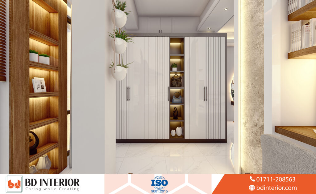
You’re in the paint aisle, faced with a wall of white swatches: Snow Day, Alabaster, Chantilly Lace. They all look identical—just white—but you know choosing the wrong shade can turn your dream space into a cold, sterile nightmare. You want a bright, airy look, but fear making the wrong choice for your home.
This isn’t just about paint. It’s about creating a feeling, a sanctuary. And the fear that you’ll spend thousands of taka and countless hours only to end up with walls that feel cold, clinical, or just plain boring is completely valid. You’re right to be cautious. Let’s share why this seemingly simple choice trips up so many homeowners.
White Wall Trap: Why So Many People Get It Wrong
The white wall trap is a common pitfall: a homeowner’s vision for a bright, serene space results in a room that feels sterile, cold, or shows an unexpected color cast. This often happens when we underestimate the power of undertones and lighting, leading to a space that feels clinical and unfinished rather than chic and inviting.
Incorporating analogous colours—those sitting next to each other on the color wheel—can create a harmonious and calming transition between white-walled rooms and adjacent colorful spaces.
Mastering the Killam Colour System allows you to categorize whites by their specific undertones—such as pink, green, or violet—preventing the clash that occurs when disparate neutrals are placed side-by-side.
The Undertone Betrayal: When “White” Turns Blue
White paint can be deceiving. It’s packed with subtle undertones—cool blues, warm yellows, even pinks—that only reveal themselves on your walls.
Lighting is their accomplice. A cool, crisp white that looked perfect under the hardware store’s fluorescent lights can suddenly turn icy blue in a north-facing room with cool natural light. One frustrated Houzz user learned this the hard way, warning others that their paint choice, “Lexicon is blue, especially in dark rooms.” This is the ultimate betrayal. You paid for white, and you got a color you never wanted. The “so what?” here is that your cozy living room now feels like an arctic research station.
The “Sterile Box” Syndrome
The other fear is the personality vacuum. Sometimes, the all-white-everything trend can leave a home feeling less like a cozy nest and more like a modern art gallery. Many homeowners voice this concern after the fact.
A Reddit commenter recently captured this backlash perfectly, calling the look “overdone” and taking offense to rooms where everything is white—walls, countertops, furniture. It creates a flat, one-dimensional experience. As one designer put it, “To me, an all-white home never feels truly finished. The rooms begin to blend into each other, and there is no vibrancy or energy in the space. It feels flat.” Your home ends up lacking a story, a soul.
While Scandinavian Minimalism popularized the all-white look for its ability to maximize limited northern sunlight, it requires specific wood accents to avoid feeling uncomfortably cold or clinical.
The Scuff Mark Reality Check
We have to talk about the practical side and maintenance. If you have kids, pets, or just… live in your house, you know that walls are magnets for life’s little messes. A designer I know was brutally honest about this: “White walls show everything from scuffs, smudges, and fingerprints to shadowing where furniture once sat… Families with young children or pets often find this out the hard way.” You envision a pristine backdrop, but the reality is a constant battle with a magic eraser, chasing down every little mark. It’s exhausting.
To balance the fragility of white walls, many active families invest in Sunbrella performance fabrics for their seating, ensuring that spills can be easily cleaned without compromising the room’s palette.
Quick Action Plan: Before you read on, walk around your room. Notice the light. Is it warm and golden or cool and grey? This is your first clue to solving the white paint puzzle.
The Secret to White Walls You’ll Actually Love
So, white walls are a minefield of potential disasters. But what if I told you there’s a proven formula to get it right, every single time? The secret to achieving warm, inviting, and stunning white interiors isn’t about finding one “perfect” shade. It’s about understanding the science and art of how white works within a space.
Cracking the Code: Undertones and LRV
This is where you go from amateur to pro. Instead of guessing, you need to learn the language of paint. The two most important terms in your new vocabulary are Undertones and LRV.
Warm vs. Cool vs. Neutral Whites
- Warm Whites: These have yellow, cream, or beige undertones. They feel cozy and inviting and are fantastic for creating a soft, sunlit glow, even in rooms with less natural light. Think of the color of buttercream frosting.
- Cool Whites: These have blue, grey, or green undertones. They feel crisp, clean, and modern. They are excellent for south-facing rooms that get a lot of warm light, as they can balance the intensity and keep the space from feeling too yellow.
- Neutral (or ‘True’) Whites: These have the least amount of obvious undertone. They are the most versatile and act as a true blank canvas. But be warned, in certain lights, even they can lean slightly cool or warm.
Your New Best Friend: Light Reflectance Value (LRV)
LRV is a scale from 0 (pure black) to 100 (pure white) that measures how much light a color reflects. The higher the LRV, the more light it bounces around the room. Pure whites often have an LRV above 80. So what? A high-LRV white can make a small, dark room feel significantly brighter and more open, while a lower-LRV off-white can make a cavernous, bright room feel a bit cozier.
Texture is Your Superpower: The Antidote to “Boring”
This is the single biggest secret pro designers know. As the experts at Decoist state, “successful white interiors rely heavily on texture.” A room with white walls can feel flat, but one with a chunky wool throw, a linen sofa, a brushed-oak coffee table, and a natural-stone vase feels layered, complex, and incredibly sophisticated. Texture creates depth and interest without adding visual clutter. It’s how you make white feel rich.
In a typical 1,200 sq ft apartment, using a consistent white throughout the main living areas creates a seamless flow that makes the entire footprint feel significantly more expansive.
Effective visual grounding in an all-white space is achieved by using darker flooring or heavy furniture pieces to prevent the room from feeling like it’s floating or lacks structure.
Swapping stark whites for earthy mushroom tones can provide the same airy feel while offering more warmth and hiding minor imperfections better than a pure, brilliant white.
Professional decorators often opt for complex neutrals, which contain multiple pigments to create a more dynamic and living color that shifts beautifully as natural daylight moves across the room.
Integrating biophilic design elements like indoor greenery and raw timber helps white walls feel more connected to the natural world, significantly reducing the sterile box effect often reported by homeowners.
Think about running your hand over a smooth plaster wall versus a rough linen pillow. That sensory difference is what gives an all-white room its character.
Let There Be (the Right) Light
Your lighting—both natural and artificial—is the final ingredient. You MUST test your paint swatches on different walls in your room and check them in the morning, afternoon, and at night with the lights on. The warm light from an incandescent bulb will make any white look creamier, while a cool LED can bring out its blue or grey undertones. Your paint color doesn’t exist in a vacuum; it’s in a constant dance with the light around it.
Utilizing 3D visualization software before committing to a shade allows you to simulate how different whites will interact with your specific architectural features and window placements throughout the day.
Consulting with a certified True Colour Expert can eliminate the guesswork of selecting paint, as these professionals are trained to identify the subtle nuances that change under varying light conditions.
Quick Action Plan: Go to a paint store and grab three samples: one warm white (like Benjamin Moore’s Simply White), one cool white (like Sherwin-Williams’ Extra White), and one neutral (like Chantilly Lace). Paint large squares on your wall and live with them for two days. The winner will be obvious.
Practicing value engineering during your remodel allows you to splurge on premium white paint for focal walls while using more affordable, high-coverage alternatives in closets and secondary spaces.
Designers often pivot to Farrow & Ball’s Wimborne White because its touch of yellow pigment creates a softer, more historical depth than standard off-the-shelf options found at big-box retailers.
Great Debate: Are White Walls Still in Style?
The trend cycle for white walls is a hot topic among designers, with some claiming they are timeless while others argue they are fading from the spotlight. In reality, white walls aren’t a trend; they are a foundational design tool whose application evolves with current aesthetic preferences.
The enduring popularity of the Modern Farmhouse aesthetic has cemented interior design white walls as a staple, typically paired with black hardware and reclaimed wood to create high-contrast visual interest.
Some designers, like Kati Curtis, observe, “White walls are (thankfully) gradually fading from the trend spotlight… the current shift towards warmer and more character-filled spaces makes them less appealing.” The trend of stark, minimalist white-on-white is clearly cooling off.
Local interior firms like Sheraspace Ltd often recommend specific off-white palettes tailored to the unique intensity of tropical sunlight, which can differ significantly from lighting conditions in temperate climates.
High-end designers frequently pair warm white walls with Calacatta Gold marble, as the stone’s grey and gold veining perfectly complements the subtle yellow undertones found in premium paints.
Looking toward the 2024-2026 window, deeper tones like emerald and sage are increasingly used as foundational anchors to give white walls a more sophisticated, nature-inspired context.
Industry insiders in recent July 2026 design projections suggest that while stark whites are retreating, cluttercore and textured white plaster will dominate the next wave of upscale residential renovations.
The current Quiet Luxury movement relies heavily on ivory and cream tones to convey an understated sense of wealth and sophistication without relying on flashy patterns or bold pigments.
Looking ahead to 2025, forecasters expect Digital Lavender to emerge as a key accent that adds a restorative, tech-inspired cooling effect to otherwise monochromatic white living spaces.
Despite the rise of maximalism, recent 2024 consumer surveys indicate a steady 14% preference for white as the primary interior color for its perceived resale stability and psychological clarity.
My view: White isn’t out—boring white is out. Experts like Kathy Kuo argue, “White walls never go out of style because they absorb light and are versatile.” The focus now is on warmer, softer off-whites—still neutral and beautiful, but cozier. White just evolved.
White Walls: The Good, The Bad, and The Smudged
White walls have both advantages and challenges. Let’s review the key points to help you decide if they’re right for your home.
The Pros: Why Designers Keep Coming Back
- The Ultimate Canvas: As one Reddit user perfectly put it, “I favour white, we’ve got a lot of paintings, and it helps show them off.” Your art, your furniture, your textiles—they all become the star of the show.
- Space Magician: It’s not an illusion. High-LRV whites genuinely make spaces feel bigger and brighter. For small homes or apartments, this is a game-changer.
- Timeless Appeal: White is the little black dress of interior design. It’s classic and, according to a 2024 Real Estate Report, homes with neutral wall colors often sell faster.
- Endless Versatility: Cherie Lee calls it “the ultimate neutral.” You can change your decor from boho to minimalist to traditional, and you’ll never have to repaint your walls.
The Cons: The Honest Truth
- High Maintenance: There’s no getting around it. White shows dirt. If the thought of constant touch-ups gives you a headache, it might not be for you.
- The Risk of ‘Sterile’: Without proper texture and layering, you can easily end up in that cold, clinical box we talked about.
- The Agony of Choice: With literally hundreds of options, finding the right white can be overwhelming.
- Cost: Don’t cheap out. A quality white paint with good coverage is essential to avoid a streaky, translucent finish. Expect to pay anywhere from 3000/- to over 5000/- per gallon for premium brands.
Your White Wall Questions, Answered (FAQs)
How do I choose the right white paint?
Test white paint samples on large poster boards throughout your room at different times of day. Hold samples next to your trim, sofa, and flooring. What looks great in one home may not in yours—there are no shortcuts. Test first, decide second.
What paint finish is best for white walls?
For most living areas and bedrooms, an eggshell or satin finish is your best bet. It offers a soft sheen that is much more durable and wipeable than a flat or matte finish, without being overly shiny like a semi-gloss. For trim and doors, semi-gloss is the standard for its high durability.
Opting for a Modern Emulsion finish provides the ideal balance of a matte aesthetic and high washability, making it the preferred choice for high-traffic hallways and busy family rooms.
Choosing paints made from sustainable materials and low-VOC formulas ensures that your bright new interior supports better indoor air quality while reducing the environmental impact of your home renovation.
How much does it cost to paint a room white?
While a gallon of premium white paint costs between 3000/- and 5000/-, the total project cost varies. A professional painter might charge between 10000/- and 20000/- to paint an average-sized room, including labor and materials. A high-quality white paint is a worthwhile investment, as it provides better coverage and may require fewer coats.
Budgeting for a white kitchen renovation typically requires ৳3 lakh to ৳5 lakh for high-quality cabinetry finishes that won’t yellow or chip under the heavy daily use of a busy household.
Your Blueprint for the Perfect White Room
So, are white walls a design savior or a sterile mistake? The truth is, they’re neither. White isn’t just a color; it’s a powerful tool. And now, you know how to use it.
You’re no longer staring at a wall of a thousand confusing swatches. You’re looking at a palette of possibilities, armed with the knowledge of undertones, LRV, texture, and light. You can walk into that paint store with confidence, ready to create a space that is bright, personal, and anything but boring.
Stop being afraid of white and start using it with intention. The perfect backdrop for your life is waiting.
What’s the first room you’re going to transform with this new knowledge? Tell me your plans in the comments below!

S.M. Rezaul Haque is a seasoned interior design consultant with 15+ years of experience. An AIUB graduate and Senior Vice President of BIDCOA, he specializes in creating functional, sustainable, and visually inspiring spaces. As the driving force behind BD INTERIOR, he has helped shape 700+ Bangladesh’s most innovative interior design projects.